Audi’s A8 is a declaration of war on buttons, but now the battle with fingerprints begins
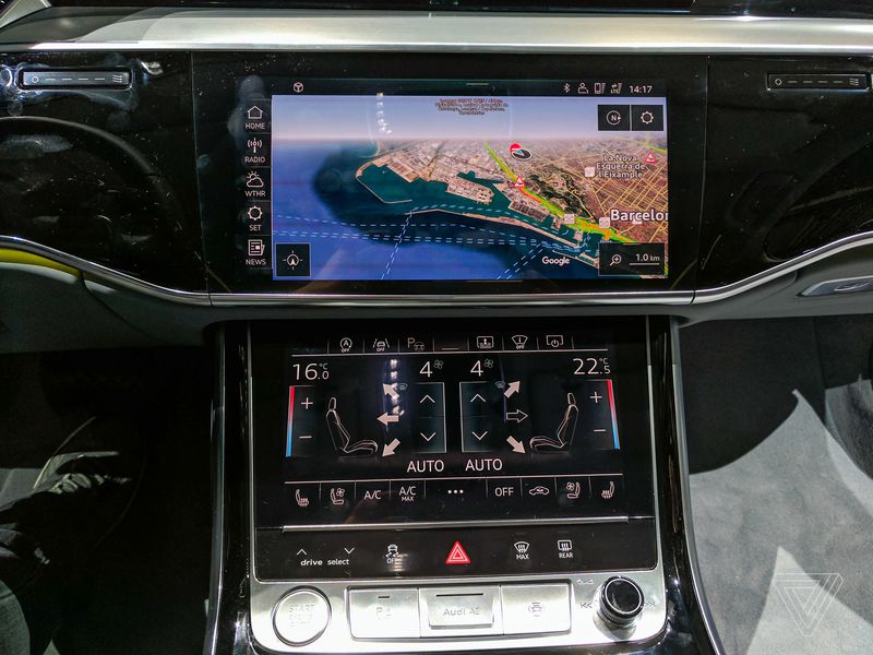
But not the new Audi A8. This luxury sedan exhibits a deliberate hostility to buttons, opting instead for smooth black surfaces that transform into multifunctional touchscreens with realistic haptic feedback when the car is turned on. It’s a laudable and overdue minimalism in car design, but having spent the past 40 minutes inside the A8’s cabin, I can say it’s only a step in the right direction — one that shows we’re still closer to the beginning than the end of car UI improvement.
Let’s start with the good stuff about the A8’s interior: if you think of buttons as visual clutter, as I do, the A8 has an appealing zealousness for cleaning up and streamlining. The new dashboard feels more congruent with the dominant mode of interaction on the car — touch — and sheds more of the historical button reliance. The remnant buttons are mostly on the steering wheel and make sense. I’m not going to leap to saying the interaction between those buttons and the screen in front of the driver is intuitive, but it’s getting there. There’s also a volume knob on the passenger’s side and a few other hard buttons — like the emergency lights switch — that remain there for safety reasons.
Everything else has been usurped by the large center console, which sports not one but two sharp, high-contrast displays. Both have haptic feedback that simulates pressing an actual button — such as you’ll find on the iPhone 7’s home button — which isn’t 100 percent convincing, but again, it’s better than we’ve seen in the past.

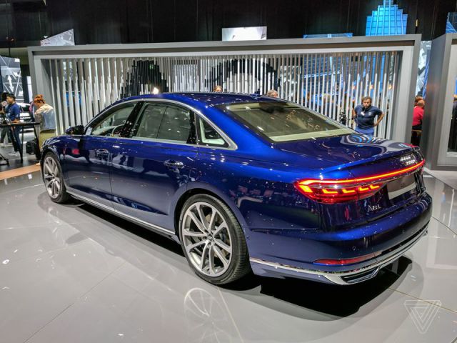
Audi says the speed and responsiveness of its UI have improved along with the sharpness of its screens. I find both to be of a satisfying nature, especially the middle displays, which aren’t OLED (whereas the taillights of the A8 are OLED!), but can be mistaken for it with their deep, inky blacks.
The rear seats have tons of headroom and do feel as luxurious as the A8’s €90,600 price tag and status as Audi’s flagship would suggest. They’re also deluged by screens. There’s a large tablet perched on each headrest, both removable, and a smaller phablet-sized device ensconced in the center column. Between them, you’re able to control most things about the car, including the radio station and volume, individual lighting areas, and of course climate control. The phablet in the middle has an OLED display and, should you pop a SIM into the A8, it can also be used to make phone calls. Yes, it’s the 2017 version of the classic carphone.

Where this whole modernist approach starts to fall down and disintegrate, however, is in Audi’s choice of materials. The glossy black panels are certainly slick, but they stay that way for exactly 20 seconds before they need someone to brush away the dust or fingerprints they pick up. And where they’re not high-tech displays, those black sections are a pretty thin and unpleasant plastic (not quite as bad as the LG G2, but certainly in the vicinity of the Galaxy S4). The A8 has wood paneling options, but those also feel thin and are meanly distributed across the interior, evincing none of the luxury feel that such materials should evoke. It seems like Audi decided to go high on tech and cheap on materials, whereas a car competing with the likes of the Mercedes S-Class must achieve high standards in both.

I do enjoy the Bang & Olufsen speaker system inside this new A8, which sounds crisp and punchy. And comparing Audi’s new Android-based touchscreen interface to earlier attempts from car companies shows encouraging signs of progress. It’s pretty cool to also see many of the future car concepts from events like the Consumer Electronics Show in Las Vegas coming to fruition in a production car. The automated parking assist that parks the car with or without the driver inside is something we first saw at CES in 2013, and now it’s a reality.
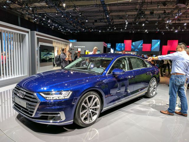
The A8 is autonomous to Level 3, which means that under some circumstances the car can take over complete responsibility for driving. There’s also a new active suspension system that synergizes nicely with the various self-driving sensors — such as the front camera, which helps the system predict and preemptively adapt to bumps in the road — to ensure a smoother and safer ride. There’s a lot of great, forward-thinking technology inside the A8. But it’s encapsulated in a car that doesn’t attract me with its exterior and would frustrate me deeply with its glossy plastic interior.
Photography by: Vlad Savov / The Verge
Article by: Vlad Savov / TheVerge.com
