Dash through the ages
Even in the early days, Audi paid close attention to the driver’s cockpit. From knobs and gauges to customisable screens, we look at Audi’s innovations of the dashboard.
It’s hard to imagine now, but immediately after the automobile was invented in the 20th century, the lack of standards meant that drivers faced a proliferation of gauges and meters scattered across the cabin.
Audi was one of the first to recognise that an easy-to-read dashboard resulted in safer driving and began rationalising this hotchpotch of gizmos.
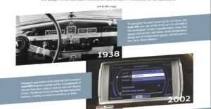
The fascia of its 1938 Audi 920, for example, gathered all the important functions and placed them directly in the driver’s field of vision.
This basic format developed through the years, evolving to include entertainment from radio to CD players. The biggest shakeup came with in-car satellite navigation in the 2000s.
Soon, fascias gained an LCD screen that doubled as the nerve centre of the vehicle’s infotainment.
But buttons would not suffice in the age of the graphical user interface. Thus, MMI (or Multi Media Interface) was born, starting with an ingenious rotary knob that scrolled through a screen, and has since been constantly upgraded.
The current version includes MMI touch, on which drivers may enter a destination or a phone number by drawing on the control panel.


Additionally, the Audi music interface, Bluetooth interface and Apple CarPlay make it easy to connect mobile devices.
With the latest Audi virtual cockpit, the instrument cluster is now fully in the digital 21st century, with different modes to take care of different needs, all controlled via the fingertips on the steering wheel.
Peering into the future, the human-machine interface will become more seamless than ever. The virtual dashboard seen in the Audi e-tron quattro concept includes a touch-sensitive dual-screen MMI controller and display.
The idea of the car as an extension of the driver doesn’t seem to be that far-fetched any longer.
